1. Executive summary
This research audits the digital accessibility of seven of the most-accessed and mandatory-to-use Indonesian government public service websites, using the international WCAG 2.2 Level A and AA standards. Testing was conducted at the homepage level and, for websites with a public registration/login flow (Pajak, OSS, LAPOR!), that page was also included as part of the testing scope.
Most notable result: not a single one of the seven websites tested achieved a Grade C or higher. Three websites received a Grade D, and the rest received a Grade F.
| Website | Score | Grade |
|---|---|---|
| Portal Informasi Indonesia | 45.5/100 | D |
| Direktorat Jenderal Imigrasi | 44.5/100 | D |
| LAPOR! v4.0 | 44/100 | D |
| BPJS Kesehatan | 27.5/100 | F |
| BPJS Ketenagakerjaan | 18.5/100 | F |
| OSS RBA | 10.5/100 | F |
| Direktorat Jenderal Pajak | -7/100 | F |
Not a single website, including the one with the relatively "best" score among the seven, came close to the passing threshold (Grade C or above). Recurring findings include: navigation elements and functional buttons that are completely inaccessible via keyboard (found on all seven websites without exception), illogical heading structure, below-standard color contrast, focus indicators that are completely invisible on three websites, and form labels disconnected from their controls in code on two websites with registration flows involving citizens' legal and financial data.
This research also gave each agency an opportunity to respond to the findings before publication, and examined the use of accessibility overlay widgets as part of the analysis (without counting it as a score-boosting factor). Direktorat Jenderal Imigrasi, despite using an overlay from UserWay and scoring highest among the seven websites, still had core services that were completely inaccessible via keyboard, proving that overlays do not automatically fix structural problems.
The findings of this research also converge with SAFEnet's research (2025) on the three websites tested by both studies (pajak.go.id, bpjs-kesehatan.go.id, and lapor.go.id), reinforcing that the failure patterns found are not a methodological coincidence of a single tester, but a real condition experienced by disabled users every day.
2. Background & urgency
Public services in Indonesia increasingly rely on digital channels such as websites and mobile apps, from managing civil registration documents, passport renewals, tax payments, BPJS registration, to business licensing, all of which can now be done through official public service websites. When these websites are inaccessible to disabled users, they experience not just inconvenience, but also loss of access to the same basic rights as other citizens.
Indonesia ratified the Convention on the Rights of Persons with Disabilities (UN CRPD) in 2011, and enacted Law Number 8 of 2016 on Persons with Disabilities, which explicitly mandates accessibility of public services, including digital ones. Nevertheless, based on the Research Report on the Accessibility of Indonesian Public Service Websites for Blind and Low Vision Users conducted and published by SAFEnet, all websites tested had barriers for blind and low vision users. (SAFEnet, 2025)
The scale of the affected population is also not small, although the exact figure varies depending on the definition used. Kemenko PMK recorded around 22.97 million persons with disabilities in Indonesia in 2023, or around 8.5% of the population. Meanwhile, BPS data based on the 2020 Population Census Long Form using the Washington Group Short Set definition recorded a Type 1 disability prevalence (broadest definition) of 6.42% nationally. Regardless of measurement methodology differences, the population potentially affected by inaccessible government websites still numbers in the tens of millions.
This research was compiled to provide an objective and measurable picture of the extent to which Indonesia's most crucial public service websites are truly accessible, while also serving as a basis for advocacy and concrete improvement recommendations for website administrators.
SAFEnet, in collaboration with the Disability Center of Universitas Hasanuddin, published similar research in 2025 that tested 20 public service websites using a combination of user testing with blind and low vision users (totally blind and low vision) and technical WAVE evaluation, focusing on the WCAG 2.1 AA standard (SAFEnet, 2025).
This research complements it in terms of criteria coverage (WCAG 2.2 A/AA, covering motor and cognitive disabilities in addition to blindness) and depth of audit per Success Criterion on seven high-volume transactional websites, accompanied by open scores per website and an official response mechanism from the relevant agencies. Three websites in this research, namely pajak.go.id, bpjs-kesehatan.go.id, and lapor.go.id, are also included in SAFEnet's research scope, so the results of both studies can be compared for findings on the same websites using different methodologies.
3. Methodology
3.1 Website selection criteria
Websites were selected based on five criteria:
- mandatory to use, with no alternative channel;
- large active user base;
- high risk to basic rights if inaccessible;
- cross-functional government representation, not just one sector; and
- high relevance for users with disabilities specifically (for example, health and employment services).
The exception to these five criteria is Portal Informasi Indonesia, which the tester considers to represent the "face" of Indonesia to a global audience.
This research deliberately limited its scope to seven websites with the broadest user base, given the time and resource constraints of the tester.
3.2 Scoring rubric
To make comparison between websites easier, the tester created a numerical scoring scheme to make it more measurable. Each website starts from a score of 100, deducted for each finding based on severity level:
- Critical: −3 points
- Serious: −2 points
- Moderate: −1 point
- Minor: −0.5 points
This scheme was chosen after testing several steeper scale alternatives (where scores almost always fell far below zero for all websites, making them less useful for comparison).
Scores are converted to a grade on the following scale:
- Grade A: 90-100 points
- Grade B: 75-89 points
- Grade C: 60-74 points
- Grade D: 40-59 points
- Grade F: 0-39 points
Severity determination was not applied uniformly to all findings, but was adjusted for each Success Criterion. Each criterion has a different pattern of impact on users, so the Critical, Serious, Moderate, and Minor thresholds were determined specifically per criterion, not based on a single generic definition applied uniformly.
As an example, for 1.1.1 (Non-text Content), functional elements such as icon-based buttons or links with no name at all are categorized as Critical, while decorative images not given an empty marker are categorized as Minor. For 1.4.3 (Contrast Minimum), contrast below the AA threshold but still above a 2:1 ratio is categorized as Serious as the default condition, and only escalates to Critical if the contrast ratio is so low that it is nearly unreadable. Some criteria, such as 2.3.1 (Three Flashes or Below Threshold) concerning photosensitive seizure risk, or 3.3.4 (Error Prevention for legal and financial transactions), do not follow this tiered gradation pattern because the scope of those criteria is already specific to high-risk situations.
This granular approach ensures the final score reflects the real impact of a violation on users, not merely the number of violations found. The complete severity mapping for all 55 Level A and AA Success Criteria is listed in the Appendix.
3.3 Deduplication policy
The same issue can violate more than one Success Criterion at once (for example, a label not connected to an input violates both 1.3.1 and 2.5.3). To prevent one issue from being counted multiple times and inflating the score, findings with an identical root cause are only counted once as a score deduction; their appearance under other Success Criteria is recorded as a cross-reference without additional point deduction, unless both occurrences genuinely represent two independent failure mechanisms.
3.4 Testing methods
A combination of three methods was used for each criterion: manual testing (keyboard navigation, code inspection), screen reader testing (VoiceOver + TalkBack), and automated testing using browser tools (WAVE, headingsMap), with the testing dates and tool versions recorded in the Appendix for replication purposes.
Testing was limited to the mobile view of the websites, considering that the majority of website visitors in Indonesia use a handphone/smartphone. (StatCounter, 2026)
3.5 Accessibility overlay widget check
Each website was also checked for the presence of a third-party accessibility overlay widget. The presence of an overlay was not counted as a score-boosting factor; instead, this research specifically noted whether websites using an overlay still had critical findings, as independent comparative data against the instant compliance claims often marketed for overlay products.
3.6 Right-to-respond process with relevant agencies
Before publication, each relevant agency was contacted and given 14 working days to respond to the preliminary findings. Responses received are listed in the respective Findings per website section; agencies that did not respond by the deadline are consistently recorded as "no response."
3.7 Testing limitations
This testing was limited to the homepage level and (for certain websites) the public registration/login flow, not a comprehensive audit of all pages and features of the websites. Findings are a snapshot at a specific point in time (7-10 August 2026) and may change as websites are updated. Testing was conducted by a single CPACC-certified auditor using a combination of automated and manual testing, not user acceptance testing with actual users with disabilities.
Testing was also not conducted on the overall accessibility of third-party widgets (such as chat and accessibility overlays), but was limited only to the entry point leading to those widgets.
4. Findings per website
Each website is presented in a consistent format for easy comparison:
- Brief profile and tested URL
- Score and breakdown of findings by severity level
- Summary of key findings
- Agency response
The full list of findings can be accessed at Google Sheets: Findings Log.
4.1 Portal Informasi Indonesia
Portal Informasi Indonesia is a source of information about Indonesia, such as the latest news, profiles of the President, Vice President, parliament, and ministries/agencies/regional governments, as well as photo and video galleries. This website is managed by Komdigi.
The Portal Informasi Indonesia page tested was:
- https://indonesia.go.id, as the main page. Testing focused on the Indonesian-language version. The English-language version was only partially tested to check the accuracy of the
lang="en"attribute.
4.1.1 Portal audit findings
| Level | Passed | Failed | Not found / not relevant |
|---|---|---|---|
| Level A | 9 | 8 | 14 |
| Level AA | 8 | 9 | 7 |
| A+AA | 17 | 17 | 21 |
| Severity | Number of findings |
|---|---|
| Critical | 7 |
| Serious | 13 |
| Moderate | 4 |
| Minor | 7 |
| Reference | 3 |
4.1.2 Summary of portal findings
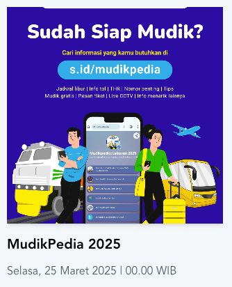
- Links in the "Infografis" and "Galeri Foto" content are not accessible via keyboard.Keyboard-only users and screen reader users cannot reach these links at all.
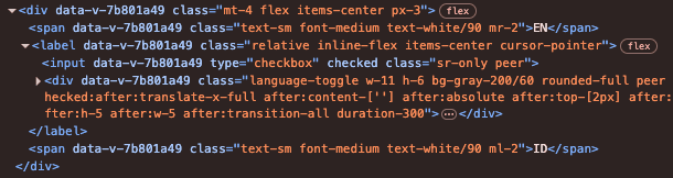
- The language switch toggle has no label at all. The language switch option has no accessible name, so screen reader users cannot tell what this element is for.
- The IndonesiaGoID logo has very low contrast (2.5:1 for the white element, 1.7:1 for the red element, far below the 3:1 minimum threshold for non-text elements), nearly unreadable for low vision users or users in bright light.

- Social media icons in the footer have no labels. Four links (Facebook, Twitter, Instagram, YouTube) contain only icons without
aria-label, so screen readers only announce "link" with no context whatsoever. - No skiplink to the main content was found.Keyboard users must pass through the entire navbar and menu every time they open a new page before reaching the main content.
4.1.3 Response from portal administrator
The tester contacted the portal administrator via email on 12 August 2026. As of this report's publication, the tester has not received a reply from the portal administrator.
4.2 Direktorat Jenderal Imigrasi
The Ditjen Imigrasi website provides various immigration services, ranging from services for Indonesian citizens, services for foreign nationals, Golden Visa, and so on. This website uses a third-party accessibility overlay provided by UserWay.
The page tested was:
- https://imigrasi.go.id/, as the main page. Testing focused on the Indonesian-language version. The English-language version was only partially tested to check the accuracy of the
lang="en"attribute.
4.2.1 Ditjen Imigrasi audit findings
| Level | Passed | Failed | Not found / not relevant |
|---|---|---|---|
| Level A | 8 | 8 | 15 |
| Level AA | 11 | 5 | 8 |
| A+AA | 19 | 13 | 23 |
| Severity | Number of findings |
|---|---|
| Critical | 13 |
| Serious | 6 |
| Moderate | 0 |
| Minor | 9 |
| Reference | 13 |
4.2.2 Summary of Ditjen Imigrasi findings
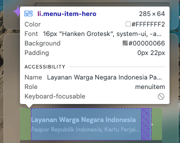
- Immigration services are not accessible via keyboard. Access to the website's core feature (passport/visa applications and related services) cannot be reached by keyboard-only users at all.
- The chat feature and official site info are not accessible via keyboard. Two other functional elements are also barriers for keyboard-only users, showing a recurring pattern rather than an isolated case.

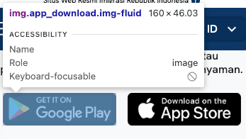
- Social media links and app download links (AppStore/GooglePlay) have no name. These functional links are entirely unknown to screen reader users.
- Focus indicator is not visible on the language menu and News items.Keyboard users lose track of their position when navigating these two components.
- The overlay does not help. Although the Ditjen Imigrasi website scored the highest, the tester found no evidence that the overlay used improves/enhances this website's accessibility. This is proven by the immigration service being inaccessible via keyboard, and by several elements still lacking labels.
4.2.3 Response from Ditjen Imigrasi
The tester contacted Ditjen Imigrasi via email on 12 August 2026. As of this report's publication, the tester has not received a reply from Ditjen Imigrasi.
4.3 LAPOR! v4.0
LAPOR! is a public complaint platform for agencies based on various reporting categories. There are currently 2 live versions: v4.0, which has 10 agencies, and v3.5 for other agencies not yet on v4.0. Nevertheless, the tester chose v4.0, assuming the other agencies will migrate to that latest version.
The LAPOR! v4.0 pages tested were:
- https://lapor.go.id: as the "gateway" to v4.0. Testing was limited to the version-selection popup.
- https://prod.lapor.go.id: the v4.0 main page.
- https://prod.lapor.go.id/login: the login form.
- https://prod.lapor.go.id/register: the registration form.
4.3.1 LAPOR! audit findings
| Level | Passed | Failed | Not found / not relevant |
|---|---|---|---|
| Level A | 6 | 11 | 14 |
| Level AA | 10 | 8 | 6 |
| A+AA | 16 | 19 | 20 |
| Severity | Number of findings |
|---|---|
| Critical | 9 |
| Serious | 11 |
| Moderate | 6 |
| Minor | 2 |
| Reference | 17 |
4.3.2 Summary of LAPOR! findings
- Users are not informed to login before creating a report. Users can fill out the report form completely, but only when trying to submit it are they informed they must login first.

- The Report Category menu has no name at all. The tab menu for selecting the report category contains only
radiobuttons withoutaria-label, so screen reader users do not know what this menu is for.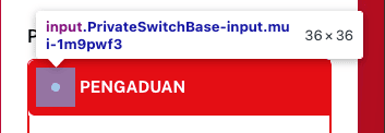
- Required-field status is only marked with an asterisk symbol, which is not read by screen readers. All required fields on the reporting form are only marked with a visual asterisk (*), without a
requiredoraria-requiredattribute in the code, so the required status is not conveyed to screen reader users.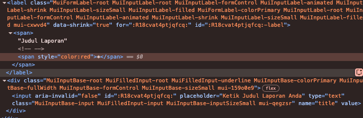
- The accessible name of the Attachment Upload button does not match the visible text. The button's visible text reads "Upload Lampiran," but its
aria-labelreads "Unggah Lampiran (...)," which fails to meet the requirement for consistency between the visible label and the name announced to assistive technology.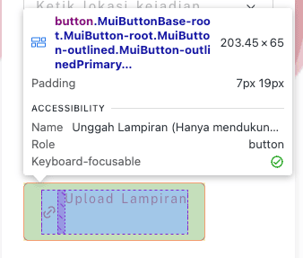
4.3.3 Response from LAPOR! administrator
The tester contacted the LAPOR! administrator via the contact form on the LAPOR! website on 12 August 2026. As of this report's publication, the tester has not received a reply from the LAPOR! administrator.
4.4 BPJS Kesehatan
The BPJS Kesehatan website provides information about the profile of the managing body, various types of health coverage, news and other public information, as well as links to download the app available on the AppStore and Google Play.
The BPJS Kesehatan page tested was:
- https://www.bpjs-kesehatan.go.id/#/, as the main page. Testing focused on the Indonesian-language version. The English-language version was only partially tested to check the accuracy of the
lang="en"attribute.
4.4.1 BPJS Kesehatan audit findings
| Level | Passed | Failed | Not found / not relevant |
|---|---|---|---|
| Level A | 8 | 10 | 13 |
| Level AA | 9 | 8 | 7 |
| A+AA | 17 | 18 | 20 |
| Severity | Number of findings |
|---|---|
| Critical | 15 |
| Serious | 12 |
| Moderate | 0 |
| Minor | 7 |
| Reference | 16 |
4.4.2 Summary of BPJS Kesehatan findings
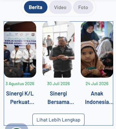
- Four functional controls are not accessible via keyboard, including cookie settings, pagination on the slider, "Berita" items, and links in "Informasi Terbaru." This recurring pattern indicates a systemic problem, not an isolated case in a single component.
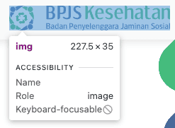
- Many functional elements have no name at all: logo (navbar and footer), social media icons, AppStore/GooglePlay links, the sticky Contact link, cookie settings button, and ISO certification link, all without an accessible name.
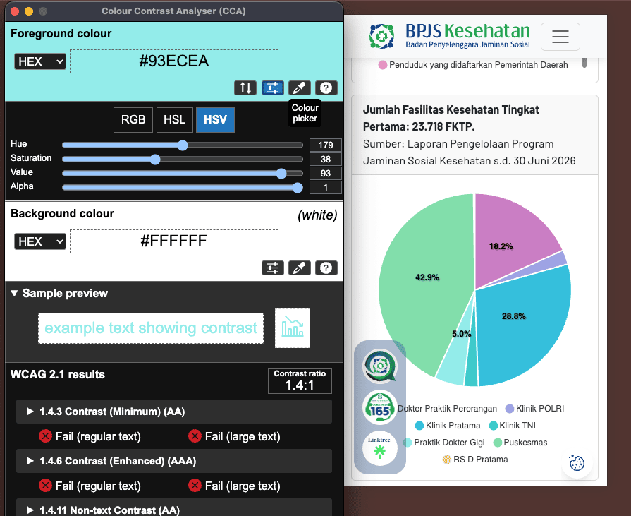
- Color contrast on the chart is very low (1.4:1, far below the minimum threshold), a high risk because this chart likely conveys data related to health/membership information important to users.
- The ISO certification link has a dual problem: besides having no
altattribute, the link also does not lead anywhere when clicked, a combination of a dead link and a missing label on the same element. - The English-language version of the website still uses
lang="id". Screen readers will read English-language content using Indonesian phonetic rules, reducing readability for users accessing the English version of this website.
4.4.3 Response from BPJS Kesehatan
The tester contacted BPJS Kesehatan via email on 12 August 2026. As of this report's publication, the tester has not received a reply from BPJS Kesehatan.
4.5 BPJS Ketenagakerjaan
The BPJS Ketenagakerjaan website provides information about types of membership, how to claim membership benefits, as well as news and other public information.
The BPJS Ketenagakerjaan pages tested were:
- https://www.bpjsketenagakerjaan.go.id, as the main testing page.
- https://www.bpjsketenagakerjaan.go.id/en, as the alternative English-language page. Testing on this page was limited to the
langattribute section.
4.5.1 BPJS Ketenagakerjaan audit findings
| Level | Passed | Failed | Not found / not relevant |
|---|---|---|---|
| Level A | 8 | 10 | 13 |
| Level AA | 7 | 10 | 7 |
| A+AA | 15 | 20 | 20 |
| Severity | Number of findings |
|---|---|
| Critical | 12 |
| Serious | 18 |
| Moderate | 6 |
| Minor | 7 |
| Reference | 5 |
4.5.2 Summary of BPJS Ketenagakerjaan findings
- Not a single element on the entire page has a visible focus indicator. Unlike other websites that usually only lose focus visibility on certain components, here the problem is comprehensive. Keyboard users genuinely do not know which element they are on while navigating.
- Text on the main (hero) slider has extremely low contrast, down to 1.1:1, almost no color difference at all between the text and background, far below any minimum threshold.

- Three main navigation elements are not accessible via keyboard: the popup banner, the "Saya Mau" menu, and the main menu below the hero. This combination makes most of the site's core navigation unreachable without a mouse.
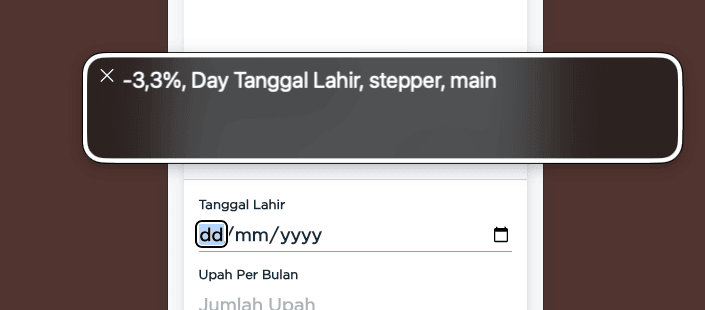
- The Balance Calculation simulation feature (JHT/JP) has problems on multiple layers. Input errors are only reported on the first incorrect field, the date-of-birth format is read incorrectly by VoiceOver, and the calculation result is not announced to screen readers at all, even though this is the most important feature on this website.
- No skiplink to the main content was found, forcing keyboard users to pass through the entire navigation every time they open a page.
4.5.3 Response from BPJS Ketenagakerjaan
The tester contacted BPJS Ketenagakerjaan via email on 12 August 2026. As of this report's publication, the tester has not received a reply from BPJS Ketenagakerjaan.
4.6 OSS RBA
OSS RBA (Online Single Submission Risk-Based) is an integrated electronic business licensing system managed by the Ministry of Investment/BKPM, used by business operators to manage various types of business licenses in Indonesia.
The OSS RBA pages tested were:
- https://oss.go.id/id, as the main testing page.
- https://oss.go.id/en, as the alternative English-language page. Testing on this page was limited to the
langattribute section. - https://ui-login.oss.go.id/login: the login form.
- https://ui-login.oss.go.id/register: the registration form.
4.6.1 OSS RBA audit findings
| Level | Passed | Failed | Not found / not relevant |
|---|---|---|---|
| Level A | 9 | 13 | 9 |
| Level AA | 9 | 10 | 5 |
| A+AA | 18 | 23 | 14 |
| Severity | Number of findings |
|---|---|
| Critical | 16 |
| Serious | 17 |
| Moderate | 5 |
| Minor | 5 |
| Reference | 22 |
4.6.2 Summary of OSS RBA findings
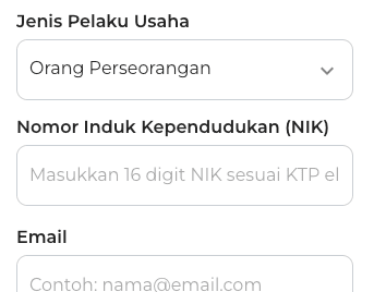
- Labels on the login and registration forms are not connected in code to their fields. Both of this website's core forms fail at the most fundamental point: screen reader users cannot tell which field is for what, because the
labelis never associated with theinputviafor/id.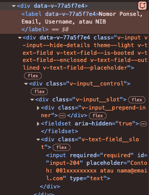
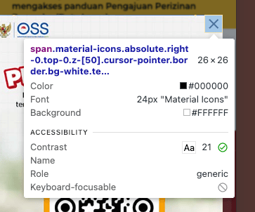
- Six main navigation elements have no name at all: the popupbanner, the banner close button, banner pagination, the announcement close button, the Search button, and the hamburger menu. Almost every entry point to this website cannot be recognized by screen reader users.
- There is no visible focus indicator on any of the login and registration input fields.Keyboard users type without knowing exactly which field they are in.
- The popup banner, announcement banner, back button, and navbar logo are all inaccessible via keyboard. This combination makes it nearly impossible for keyboard-only users to complete the login flow to the website without a mouse.
- Empty-field status on login and registration is only marked with red color, without supporting text or icon, so colorblind users or screen reader users get no signal at all about which field has a problem.
4.6.3 Response from OSS RBA administrator
The tester contacted the OSS RBA administrator via email on 12 August 2026. As of this report's publication, the tester has not received a reply from the OSS RBA administrator.
4.7 Direktorat Jenderal Pajak
The Direktorat Jenderal Pajak (DJP) website provides tax information, news and regulations, as well as the CoreTax portal as the core tax administration system for taxpayer registration and reporting.
The DJP website pages tested were:
- https://pajak.go.id/, as the main testing page.
- https://pajak.go.id/en/index-tax, as the alternative English-language page. Testing on this page was limited to the
langattribute section. - https://coretaxdjp.pajak.go.id/.../Login: the login form.
- https://coretaxdjp.pajak.go.id/.../individual-taxpayer-registration: the registration form, with the scenario "New Individual User without a Tax ID (NPWP)." Only the first registration page was tested in this research.
4.7.1 DJP audit findings
| Level | Passed | Failed | Not found / not relevant |
|---|---|---|---|
| Level A | 8 | 12 | 11 |
| Level AA | 8 | 10 | 6 |
| A+AA | 16 | 22 | 17 |
| Severity | Number of findings |
|---|---|
| Critical | 26 |
| Serious | 12 |
| Moderate | 4 |
| Minor | 2 |
| Reference | 22 |
4.7.2 Summary of DJP findings
- Almost all elements on the main page have no visible focus indicator. The scale is comprehensive, not limited to one or two components, making keyboard navigation across the entire homepage practically untrackable.
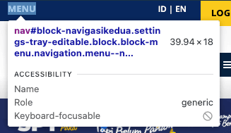
- Nine navigation and functional elements are not accessible via keyboard: the popupbanner, logo, Search, the "Menu" menu, the language selector, livechat, the tax menu, the Eselon 1 menu, and the "Pranala" menu in the footer. This is the website with the broadest scope of keyboard access failure among the seven websites tested.
- Required fields on the CoreTax registration form are only marked with an asterisk symbol, without a
requiredoraria-requiredattribute, on a form involving taxpayers' identity and legal data.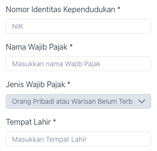
- Labels on the CoreTax registration and login forms are not connected in code to their fields, including one case where the
forattribute on the login page targets the wrong element (for="Username"when the field'sidis"userid").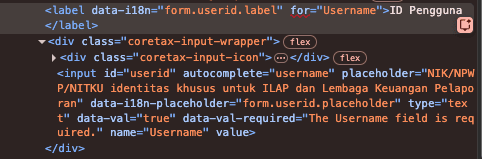
- The skiplink is broken on both main pages. On the homepage, the skiplink exists but focus is blocked and its target
idis not found (i.e. it does not work); on the CoreTax registration/login, there is no skiplink at all.
4.7.3 Response from DJP
The tester contacted DJP via email on 12 August 2026 and received the following reply on 13 August 2026:
We will forward the information you have submitted as a recommendation to the relevant unit so it can be used as input and a consideration for the improvement and enhancement of tax service quality. We inform you that the Information and Complaints Service Office (KLIP) is the unit that receives suggestions and/or complaints, and therefore we do not have access to information on follow-up actions taken by the relevant unit.
5. Cross-website analysis
| Agency | Passed | Failed | Not found / not relevant |
|---|---|---|---|
| Portal Informasi Indonesia | 17 | 17 | 21 |
| Direktorat Jenderal Imigrasi | 19 | 13 | 23 |
| LAPOR! v4.0 | 16 | 19 | 20 |
| BPJS Kesehatan | 17 | 18 | 20 |
| BPJS Ketenagakerjaan | 15 | 20 | 20 |
| OSS RBA | 18 | 23 | 14 |
| Direktorat Jenderal Pajak | 16 | 22 | 17 |
| Agency | Total issues | Critical | Serious | Moderate | Minor | Reference |
|---|---|---|---|---|---|---|
| Portal Informasi Indonesia | 34 | 7 | 13 | 4 | 3 | 7 |
| Direktorat Jenderal Imigrasi | 41 | 13 | 6 | 0 | 9 | 13 |
| LAPOR! v4.0 | 45 | 9 | 11 | 6 | 2 | 17 |
| BPJS Kesehatan | 50 | 15 | 12 | 0 | 7 | 16 |
| BPJS Ketenagakerjaan | 48 | 12 | 18 | 6 | 7 | 5 |
| OSS RBA | 65 | 16 | 17 | 5 | 5 | 22 |
| Direktorat Jenderal Pajak | 66 | 26 | 12 | 4 | 2 | 22 |
5.1 Cross-website finding patterns
Inaccessibility via keyboard (2.1.1) is the most dominant pattern, found as a Critical finding on all seven websites without exception. The scale varies, from one or two elements (Portal Informasi Indonesia) to as many as nine navigation elements at once (DJP). This pattern is worst precisely on websites with core transactional functions: immigration services on the Ditjen Imigrasi website and almost all main navigation on the DJP website are completely unreachable without a mouse.
Functional elements with no name (1.1.1) were also found on all seven websites, generally in the form of navigation icons, social media icons, and app download links (AppStore/GooglePlay) that recur on almost all websites tested.
Three websites (BPJS Ketenagakerjaan, DJP, OSS RBA) have no visible focus indicator whatsoever, either across the entire page or specifically on the login/registration form input fields. This is the most concerning pattern because it compounds with the keyboard problem above: users who manage to reach an element via keyboard still do not know where they are.
A label not connected in code to its input was found specifically on two websites with transactional registration/login flows: the CoreTax form (DJP) and the OSS RBA login/registration form. Both cases occur on forms involving citizens' legal, financial, and identity data, making the impact riskier compared to similar failures in ordinary informational content.
The skiplink to main content fails on all seven websites, either because it genuinely does not exist, or (specifically for DJP) exists but is broken, with focus blocked and the target id not found.
Direktorat Jenderal Imigrasi serves as proof that third-party accessibility overlay widgets do not automatically fix underlying problems. Despite using an overlay from UserWay and scoring the highest among the seven websites, its core service remains completely inaccessible via keyboard, and a number of elements remain unlabeled. This is consistent with the accessibility practitioner consensus that overlays cannot replace structural fixes in the source code.
5.2 Relation to SAFEnet research (2025)
Three websites in this research, namely pajak.go.id, bpjs-kesehatan.go.id, and lapor.go.id, were also tested by SAFEnet using a combination of automated testing with WAVE and user testing with blind and low vision users. Although the methodologies differ, a number of findings mutually reinforce each other:
5.2.1 DJP
SAFEnet explicitly noted "no skip link or shortcut to the main content" in testing with a low vision user, exactly matching this research's finding that the skiplink on the Pajak homepage is broken (focus blocked, target id not found) and is completely absent in the CoreTax flow.
SAFEnet also noted "some buttons have no label" and "limited keyboard navigation" repeatedly across various testing rounds, aligning with this research's finding of nine navigation elements inaccessible via keyboard and various functional icons without names.
Interestingly, SAFEnet also noted "accessibility features available" on this website in several testing rounds, likely referring to the visual accessibility widget present, but the same note was still followed by keyboard navigation and label failures, the same pattern as the ineffective overlay finding at Ditjen Imigrasi in this research.
5.2.2 BPJS Kesehatan
SAFEnet found a problem deeper than the homepage scope tested by this research: the independent registration/login process failed entirely because an image-based CAPTCHA is completely inaccessible to blind and low vision users, fully blocking access to the core service.
This research did not test that deep (the audit was limited to the homepage level), but this research's findings regarding insufficient color contrast and unlabeled navigation elements/buttons at the homepage level are consistent with SAFEnet's note that "service buttons and navigation are not responsive to screen readers" and "text does not have sufficient color contrast."
5.2.3 LAPOR!
The tester assumes SAFEnet's report on LAPOR! used v3.5, while this research used v4.0. Nevertheless, the findings recorded here show a recurring similarity of pattern across both versions.
SAFEnet repeatedly noted that "social media icons have no alternative text labels," consistent with this research's finding in the same area. SAFEnet's notes on "important homepage notifications cannot be dismissed with a screen reader" and "no Skip to Content feature" are also consistent with the pattern of failing dismissal controls and skiplinks that is a recurring theme across this research overall.
5.2.4 Conclusion
The convergence of findings from two independent studies with different methodologies (criterion-by-criterion audit by a certified auditor versus user testing with blind and low vision users) reinforces the validity of both studies: the failure pattern found is not a methodological coincidence of a single researcher, but a real condition on the ground.
6. Recommendations
The following recommendations are compiled based on the failure patterns that recur most frequently across the seven websites, not a complete list of all findings (which can be accessed in the Appendix). Recommendations are divided into three groups: quick fixes, structural fixes, and policy/organizational recommendations.
6.1 Quick wins
The following fixes are relatively simple technically, but have a large impact because they address a pattern that appears on almost all websites tested:
- Add
aria-labelor visible text to all functional icons (logo, social media icons, search button, app download links, hamburger button) that currently have no name at all. - Reconnect the
forattribute on<label>with theidon<input>across all forms, especially login and registration forms involving legal/financial data. - Add a visible focus indicator (
outlineorbox-shadowon:focus-visible) on all interactive elements, especially on the three websites that currently have no focus indicator anywhere. - Fix or add a skiplink to the main content, including ensuring the target
idgenuinely exists in the DOM (not merely having the link exist, as in DJP's case). - Replace single-color markers with additional indicators (icon, text, underline) for required status, error messages, and category differentiation on charts, so they do not rely on color alone.
- Add
required/aria-required="true"attributes to all required fields that are currently only visually marked with an asterisk.
6.2 Structural fixes
The following fixes require more time and coordination, as they concern how components are built, not merely adding attributes:
- Re-audit all custom components (dropdown, date picker, carousel, combobox) to follow the ARIA Authoring Practices Guide patterns, especially regarding
role,aria-expanded, andaria-controlsthat are consistent between the visual state and what is announced to screen readers. - Ensure all functional (clickable) elements use native semantic elements (
<a>for navigation,<button>for actions), not<div>/<article>with an event handler lackingroleandtabindex. - Replace the visual-only CAPTCHA verification mechanism with an accessible alternative (for example, audio-based verification, or a method without a visual challenge at all), especially for BPJS Kesehatan where SAFEnet found the CAPTCHA fully blocking the independent registration/login process for blind and low vision users.
- Implement live regions (
aria-live/role="status") for content that changes dynamically without a focus shift, such as calculation results, success/error notifications, and tab changes. - Build an internal design system with accessible-by-default components, so fixes do not need to be repeated manually in every new feature, and so implementation consistency between teams/agencies is better maintained.
6.3 Policy and organizational recommendations
- Incorporate accessibility testing into the routine QA cycle, not just a one-time audit. The LAPOR! case is a real example of why this matters: the same failure pattern (unlabeled social media icons, important notifications that cannot be dismissed by screen readers, unavailable skiplinks) was found consistently in both v3.5 (by SAFEnet, 2025) and v4.0 (by this research). This means migration to a new platform version occurred without ever fixing the accessibility problems already known to exist in the previous version, a sign that accessibility testing has not yet become a routine part of the development cycle.
- Avoid relying on third-party accessibility overlay widgets as the primary solution. This research's findings at Ditjen Imigrasi show that an overlay does not fix fundamental structural problems, even though that website displays an overlay from UserWay.
- Train internal development teams on WCAG and manual/screen reader testing, because most of the critical findings in this research (keyboard blocking, disconnected
labels) would not be detected by automated testing alone. - Follow up the agency response process with a remediation schedule commitment, not merely an acknowledgment of receiving the report, so there is public accountability for the promised fixes.
7. Closing
Not a single one of the seven most-accessed public service websites for Indonesian citizens achieved a Grade C or higher in this research. This is a real gap between the mandate of Law Number 8 of 2016 on Persons with Disabilities and technical implementation on the ground, especially on websites concerning citizens' basic rights: identity, health, employment, business licensing, and voicing complaints.
The convergence of findings with SAFEnet's research (2025) on the same three websites reinforces that this failure pattern is not a methodological coincidence of a single researcher, but a real condition experienced by disabled users every day. The LAPOR! case, which shows the same failure pattern between v3.5 and v4.0, also confirms that migrating to a new platform does not necessarily mean an accessibility improvement, as long as accessibility testing has not become a routine part of the development cycle.
The good news is that most of the findings in this research are technical and can be fixed gradually, not a total overhaul. Connecting label to input, adding aria-label to functional icons, and ensuring focus indicators are visible are fixes that can be done in a matter of days, not months. Larger structural fixes, such as replacing visual CAPTCHAs or building an accessible-by-default design system, do require more time, but remain within realistic reach for the managing agencies.
The tester is open to further discussion with relevant agencies regarding follow-up audits, internal team training, or remediation assistance. This research is also open to being replicated and verified by anyone; all raw data and methodology are openly listed in the Appendix section.
7.1 About the tester
This research was compiled by Rifat Najmi, founder of radikal studio (radikal.id), a digital accessibility consulting studio based in Jakarta. Rifat holds CPACC (Certified Professional in Accessibility Core Competencies) certification and has spent more than a decade in product design leadership roles at a number of leading technology companies in Indonesia, including Gojek, IBM, Halodoc, Traveloka, and Good Doctor.
Drawing on that experience, Rifat founded radikal studio with the mission of "Making Accessibility Accessible," providing WCAG audit services, inclusive design consulting, and accessibility training for organizations in Indonesia. Beyond consulting services, Rifat also manages Panduan WCAG Indonesia, an unofficial Indonesian-language translation of WCAG 2.2, as well as Aksesibel, a digital accessibility education platform open to the public.
This research was compiled independently as part of radikal studio's commitment to promoting public accountability for the accessibility of government digital services. Agencies or other parties wishing to follow up on the findings in this research, whether for a follow-up audit, team training, or remediation assistance, can contact Rifat via WhatsApp.
8. Appendix
8.1 Documentation
- Google Sheets: Findings Log
- Google Sheets: Severity Mapping
- Google Drive: Documentation for indonesia.go.id
- Google Drive: Documentation for lapor.go.id
- Google Drive: Documentation for imigrasi.go.id
- Google Drive: Documentation for bpjs-kesehatan.go.id
- Google Drive: Documentation for bpjsketenagakerjaan.go.id
- Google Drive: Documentation for oss.go.id
- Google Drive: Documentation for pajak.go.id
8.2 Tools used:
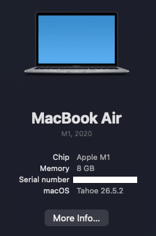
- MacOS v26.5.2 + VoiceOver
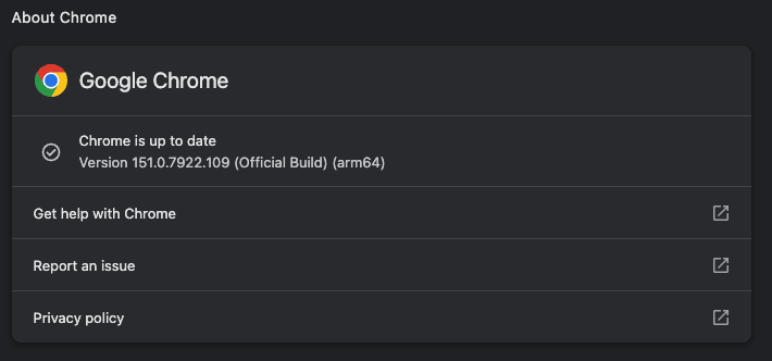
- Google Chrome v151.0.7922.109
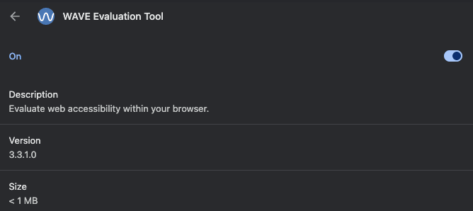
- WAVE v3.3.1.0
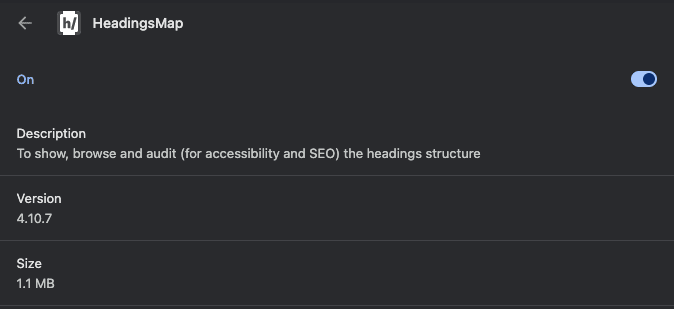
- headingsMap v4.10.7
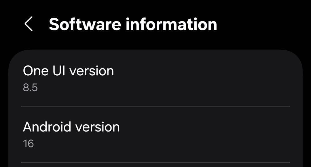
- Android v16 + TalkBack
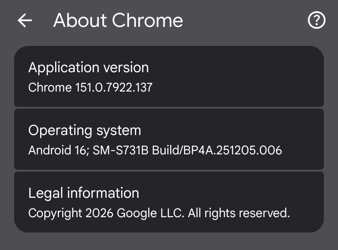
- Google Chrome v151.0.7922.137
9. Bibliography
- KemenkoPMK (2023). Pemerintah Penuhi Hak Penyandang Disabilitas di Indonesia. Accessed from https://www.kemenkopmk.go.id/pemerintah-penuhi-hak-penyandang-disabilitas-di-indonesia on 7 August 2026.
- SAFEnet (2025). Laporan Riset Aksesibiltas Situs Web Layanan Publik Indonesia untuk Disabilitas Netra. Accessed from https://safenet.or.id/laporan-riset-aksesibiltas-situs-web-layanan-publik-indonesia-untuk-disabilitas-netra/ on 7 August 2026.
- StatsCounter (2026). Screen Resolution Stats Indonesia. Accessed from https://gs.statcounter.com/screen-resolution-stats/all/indonesia on 7 August 2026.